 Cosmic asked me in a previous posting how I draw. I will try to answer the question. Cosmic may be the only one who cares, but it is an interesting exercise for me given that 'how I draw' is not something I spend a lot of time thinking about. I just do it...you know, like the Nike commercial...
I should tell you upfront that I have very little formal training in drawing so my 'process' may not be, and likely isn't, ideal. It has worked for me, however. I will try to focus on how I draw when my goal is to create something special, or something I know is going to be published by a paying customer.
Before putting pencil to paper I have, at the very least, a rough concept in my mind of what I'm trying to accomplish visually. I work out some ideas in my head about the drawings main characters (size, emotion, action, etc.), I visualize perspective, composition (how will the drawing's characters and other elements be arranged on the page), light sources, and text (when creating editorial cartoons). Sometimes if the visual problem is something I haven't dealt much with before (like drawing a golf cart) I'll do some very rough practice sketches that include the visual elements I want to include. Real artists call these 'studies' I believe and I sometimes use them when my goal is to render something entirely new.
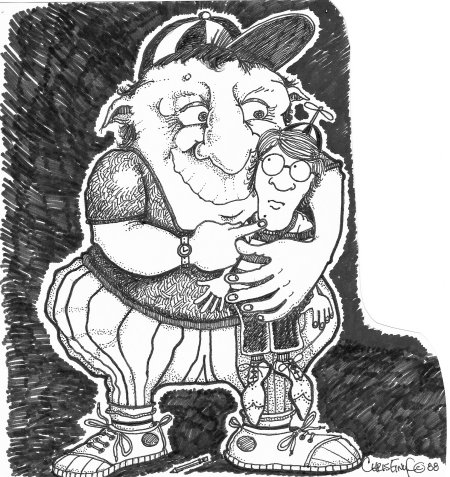
Of course, some of my drawings I like the most - like the one I've posted above - flow out of a less deliberate, more organic process that essentially starts as a doodle, but ends up being quite a bit more.
Typically, I render my initial drawing in pencil (on smooth bristol board) and do quite a bit of erasing and reworking as I go. I believe the magic, and challenge, of art is found in how the artist's mental vision is ultimately translated to an image on the page or canvas. The best artists are the ones that do this with utter ease. Incredible images just seem to flow out of them like just another breath. I've known people who can do this. Some people think I'm one of those people, but in reality I'm not even close. I often have to work hard to get a drawing 'right'. It's maddening. But, if I persist just a little while I can usually achieve my visual goals. I guess many people can't (like my wife) no matter how long they struggle with a visual problem.
A few words about getting it 'right'. This, of course, is the ultimate challenge of creating an aesthetically pleasing drawing. I think this part of the process is my strength. My strength is also drawing big, goofy, lumpy, cartoonish characters that are not constrained in any significant way by reality. My characters are typically very exaggerated (notice the large butt, Cosmic ;) ) and fanciful. Ask me to conform to reality and I will usually produce an attempt at reality that still looks very much like a cartoon. Curses. This is one of my limitations that annoys me a great deal. I think some formal training could fix it, but that's another story.
Anyway, back to getting it 'right'...
One of the things I like about the above drawing is its detail. Although exaggerated, it seems to work. I like the big dude's organic lumpiness. I like his eyes, his ears, his arms, hands and feet. I like his tennis shoes and watch. I like the little dude's propeller cap and wing tip shoes. I spent a lot of time on the textures and shadows which are both critical elements (in my opinion) to achieving a result that other people will recognize as aesthetically 'good'.
Now, back to process. Once I have sketched out in pencil I start the 'inking' process. Many professional cartoonists use brushes and india ink to ink their drawings. I prefer black Sharpies - from the very fine tipped to the broadest tipped. I ink the outline of the characters first using a 'broader' tipped Sharpie. You will notice above that the exterior lines of the characters are a little bit thicker than the interior lines. Then I move inward with finer tipped Sharpies to take care of the details. Once the inking is done I erase any residual pencil marks. A word of caution - inking can be very tricky because it is permanent and detailed ink work is not completely worked out in pencil first (at least not the way I do it). I've ruined more than one drawing with a botched ink job.
If I color a drawing I will typically use an ink wash, colored pencils, and sometimes water color. It's rare for me to color my drawings, but I think I may give it a try again, but next time I'll color my stuff using a computer and Photoshop.
Usually, I'll render a drawing from start to finish in one sitting. It is VERY rare for me to do a drawing in fits and starts. Part of that, maybe, is due to the fact I tend to get 'in the zone' when things are flowing well and I like to ride that feeling until the work is done. Some of the editorial cartoons I did took hours to complete from concept to finished product, hence the reason the cartoon deadlines were mucking with my weekends.
The secret of competent drawing, I think, is having the ability to render effectively what's in your mind or what you see right in front of you. Artists really do 'see' things differently. They see color, shadow, contour, light, dark, texture, perspective, composition, etc. and are able to capture those things when they put their pencils to paper. While artists have to be technicians to a certain extent to do what they do, I believe the most important part of their craft is embodied in the artistic intuition, talent if you will, they bring to the process. Artists don't just see their subjects, they feel or intuit them and that makes all the difference.
How do I draw?
By DadmanWell, I draw like this when I want to spend a little time with an idea...
Cosmic asked me in a previous posting how I draw. I will try to answer the question. Cosmic may be the only one who cares, but it is an interesting exercise for me given that 'how I draw' is not something I spend a lot of time thinking about. I just do it...you know, like the Nike commercial...
I should tell you upfront that I have very little formal training in drawing so my 'process' may not be, and likely isn't, ideal. It has worked for me, however. I will try to focus on how I draw when my goal is to create something special, or something I know is going to be published by a paying customer.
Before putting pencil to paper I have, at the very least, a rough concept in my mind of what I'm trying to accomplish visually. I work out some ideas in my head about the drawings main characters (size, emotion, action, etc.), I visualize perspective, composition (how will the drawing's characters and other elements be arranged on the page), light sources, and text (when creating editorial cartoons). Sometimes if the visual problem is something I haven't dealt much with before (like drawing a golf cart) I'll do some very rough practice sketches that include the visual elements I want to include. Real artists call these 'studies' I believe and I sometimes use them when my goal is to render something entirely new.
Of course, some of my drawings I like the most - like the one I've posted above - flow out of a less deliberate, more organic process that essentially starts as a doodle, but ends up being quite a bit more.
Typically, I render my initial drawing in pencil (on smooth bristol board) and do quite a bit of erasing and reworking as I go. I believe the magic, and challenge, of art is found in how the artist's mental vision is ultimately translated to an image on the page or canvas. The best artists are the ones that do this with utter ease. Incredible images just seem to flow out of them like just another breath. I've known people who can do this. Some people think I'm one of those people, but in reality I'm not even close. I often have to work hard to get a drawing 'right'. It's maddening. But, if I persist just a little while I can usually achieve my visual goals. I guess many people can't (like my wife) no matter how long they struggle with a visual problem.
A few words about getting it 'right'. This, of course, is the ultimate challenge of creating an aesthetically pleasing drawing. I think this part of the process is my strength. My strength is also drawing big, goofy, lumpy, cartoonish characters that are not constrained in any significant way by reality. My characters are typically very exaggerated (notice the large butt, Cosmic ;) ) and fanciful. Ask me to conform to reality and I will usually produce an attempt at reality that still looks very much like a cartoon. Curses. This is one of my limitations that annoys me a great deal. I think some formal training could fix it, but that's another story.
Anyway, back to getting it 'right'...
One of the things I like about the above drawing is its detail. Although exaggerated, it seems to work. I like the big dude's organic lumpiness. I like his eyes, his ears, his arms, hands and feet. I like his tennis shoes and watch. I like the little dude's propeller cap and wing tip shoes. I spent a lot of time on the textures and shadows which are both critical elements (in my opinion) to achieving a result that other people will recognize as aesthetically 'good'.
Now, back to process. Once I have sketched out in pencil I start the 'inking' process. Many professional cartoonists use brushes and india ink to ink their drawings. I prefer black Sharpies - from the very fine tipped to the broadest tipped. I ink the outline of the characters first using a 'broader' tipped Sharpie. You will notice above that the exterior lines of the characters are a little bit thicker than the interior lines. Then I move inward with finer tipped Sharpies to take care of the details. Once the inking is done I erase any residual pencil marks. A word of caution - inking can be very tricky because it is permanent and detailed ink work is not completely worked out in pencil first (at least not the way I do it). I've ruined more than one drawing with a botched ink job.
If I color a drawing I will typically use an ink wash, colored pencils, and sometimes water color. It's rare for me to color my drawings, but I think I may give it a try again, but next time I'll color my stuff using a computer and Photoshop.
Usually, I'll render a drawing from start to finish in one sitting. It is VERY rare for me to do a drawing in fits and starts. Part of that, maybe, is due to the fact I tend to get 'in the zone' when things are flowing well and I like to ride that feeling until the work is done. Some of the editorial cartoons I did took hours to complete from concept to finished product, hence the reason the cartoon deadlines were mucking with my weekends.
The secret of competent drawing, I think, is having the ability to render effectively what's in your mind or what you see right in front of you. Artists really do 'see' things differently. They see color, shadow, contour, light, dark, texture, perspective, composition, etc. and are able to capture those things when they put their pencils to paper. While artists have to be technicians to a certain extent to do what they do, I believe the most important part of their craft is embodied in the artistic intuition, talent if you will, they bring to the process. Artists don't just see their subjects, they feel or intuit them and that makes all the difference.
Cosmic asked me in a previous posting how I draw. I will try to answer the question. Cosmic may be the only one who cares, but it is an interesting exercise for me given that 'how I draw' is not something I spend a lot of time thinking about. I just do it...you know, like the Nike commercial...
I should tell you upfront that I have very little formal training in drawing so my 'process' may not be, and likely isn't, ideal. It has worked for me, however. I will try to focus on how I draw when my goal is to create something special, or something I know is going to be published by a paying customer.
Before putting pencil to paper I have, at the very least, a rough concept in my mind of what I'm trying to accomplish visually. I work out some ideas in my head about the drawings main characters (size, emotion, action, etc.), I visualize perspective, composition (how will the drawing's characters and other elements be arranged on the page), light sources, and text (when creating editorial cartoons). Sometimes if the visual problem is something I haven't dealt much with before (like drawing a golf cart) I'll do some very rough practice sketches that include the visual elements I want to include. Real artists call these 'studies' I believe and I sometimes use them when my goal is to render something entirely new.
Of course, some of my drawings I like the most - like the one I've posted above - flow out of a less deliberate, more organic process that essentially starts as a doodle, but ends up being quite a bit more.
Typically, I render my initial drawing in pencil (on smooth bristol board) and do quite a bit of erasing and reworking as I go. I believe the magic, and challenge, of art is found in how the artist's mental vision is ultimately translated to an image on the page or canvas. The best artists are the ones that do this with utter ease. Incredible images just seem to flow out of them like just another breath. I've known people who can do this. Some people think I'm one of those people, but in reality I'm not even close. I often have to work hard to get a drawing 'right'. It's maddening. But, if I persist just a little while I can usually achieve my visual goals. I guess many people can't (like my wife) no matter how long they struggle with a visual problem.
A few words about getting it 'right'. This, of course, is the ultimate challenge of creating an aesthetically pleasing drawing. I think this part of the process is my strength. My strength is also drawing big, goofy, lumpy, cartoonish characters that are not constrained in any significant way by reality. My characters are typically very exaggerated (notice the large butt, Cosmic ;) ) and fanciful. Ask me to conform to reality and I will usually produce an attempt at reality that still looks very much like a cartoon. Curses. This is one of my limitations that annoys me a great deal. I think some formal training could fix it, but that's another story.
Anyway, back to getting it 'right'...
One of the things I like about the above drawing is its detail. Although exaggerated, it seems to work. I like the big dude's organic lumpiness. I like his eyes, his ears, his arms, hands and feet. I like his tennis shoes and watch. I like the little dude's propeller cap and wing tip shoes. I spent a lot of time on the textures and shadows which are both critical elements (in my opinion) to achieving a result that other people will recognize as aesthetically 'good'.
Now, back to process. Once I have sketched out in pencil I start the 'inking' process. Many professional cartoonists use brushes and india ink to ink their drawings. I prefer black Sharpies - from the very fine tipped to the broadest tipped. I ink the outline of the characters first using a 'broader' tipped Sharpie. You will notice above that the exterior lines of the characters are a little bit thicker than the interior lines. Then I move inward with finer tipped Sharpies to take care of the details. Once the inking is done I erase any residual pencil marks. A word of caution - inking can be very tricky because it is permanent and detailed ink work is not completely worked out in pencil first (at least not the way I do it). I've ruined more than one drawing with a botched ink job.
If I color a drawing I will typically use an ink wash, colored pencils, and sometimes water color. It's rare for me to color my drawings, but I think I may give it a try again, but next time I'll color my stuff using a computer and Photoshop.
Usually, I'll render a drawing from start to finish in one sitting. It is VERY rare for me to do a drawing in fits and starts. Part of that, maybe, is due to the fact I tend to get 'in the zone' when things are flowing well and I like to ride that feeling until the work is done. Some of the editorial cartoons I did took hours to complete from concept to finished product, hence the reason the cartoon deadlines were mucking with my weekends.
The secret of competent drawing, I think, is having the ability to render effectively what's in your mind or what you see right in front of you. Artists really do 'see' things differently. They see color, shadow, contour, light, dark, texture, perspective, composition, etc. and are able to capture those things when they put their pencils to paper. While artists have to be technicians to a certain extent to do what they do, I believe the most important part of their craft is embodied in the artistic intuition, talent if you will, they bring to the process. Artists don't just see their subjects, they feel or intuit them and that makes all the difference.
Comments (40)